

OpenSurf Update: Visualization!
Simple terminal-based visualizations come to OpenSurf.

Hi team,
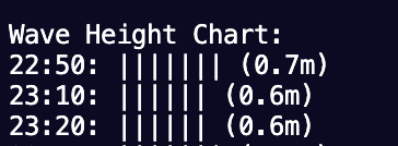
This week was another productive one. I focused on bringing visualization to life in the terminal, reviving the utils.py module with a new function to generate simple ASCII charts for wave data. This sets a solid foundation for displaying forecasts and real-time info in a clear, text-based way—which works for the command-line interface of my project so far.
What I did last week
Implemented a new function in utils.py to create ASCII bar charts. This function takes in data like wave heights or periods, scales it appropriately, and outputs a visual representation using bars to help visualize the data. It's flexible enough to handle different data ranges and includes labels for clarity.
Integrated this charting function into app.py, so now when users query data, they get not just tabular output but a quick visual summary in the terminal.
Refined error handling in the utils module to make sure invalid data inputs don't crash the visualization, adding some basic validation upfront.
What I plan to do this week
Next up, I'll build on this by adding more advanced features to the charts, like multi-series charts for visualizing the data throughout a day.
Reflection on challenges & process
Diving into ASCII art for charts was fun but tricky—getting the scaling right (and keeping it simple) without distorting the data took some thought. Overall, it's reinforcing how small, modular functions can really elevate the app's usability. The initial setup time is worth it for the polish it adds.
Cheers!